BLOG
Exploring the classic & modern interiors of London
London is a city full of contrast, the old and new seen throughout the city
keeps me continually excited to explore.
From moderns landmarks such as The Shard to classic landmarks such as Tower Bridge, the history of London is spread throughout the city and the juxtaposition of the old and new is easy to see looking at the city’s landmarks.
I love exploring museums, exhibitions, hotels and interior spaces, I'm really infatuated with interior design. The size of the AF 18mm F2.8 FE makes it great for interiors especially in places like hotels when security may be alerted to you because of a perceived “professional” set-up i.e. a big lens and the consequent commercial uses feared by security. I've had experience of this on my trip to Dubai where security was intimidated by the size of my Samyang AF 35mm F1.4 FE, switching to a smaller lens was a deciding factor in being able to take a shot of the interior so I definitely appreciate a wide-angle lens of this size.
London has more to offer to what can be immediately seen so I wanted to share the story of London's diverse architecture still keeping the theme of classic and modern seen throughout the city.
There are a lot of timelessly designed interior spaces in the city. One that springs to mind is St Paul’s cathedral which is often seen from its exterior. St Paul's Cathedral was designed by Sir Christopher Wren in 1673.
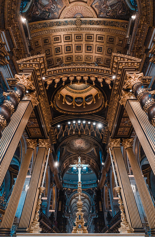
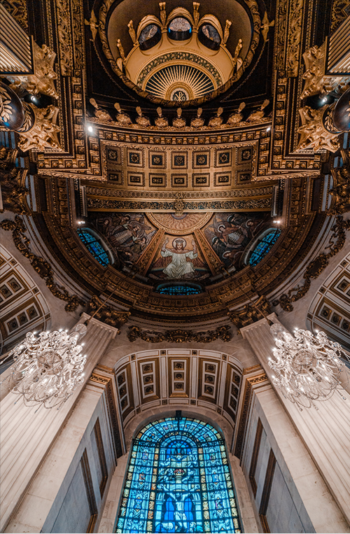
I recently visited St Paul’s cathedral and I was instantly in awe at the exquisite interior and art of the cathedral.
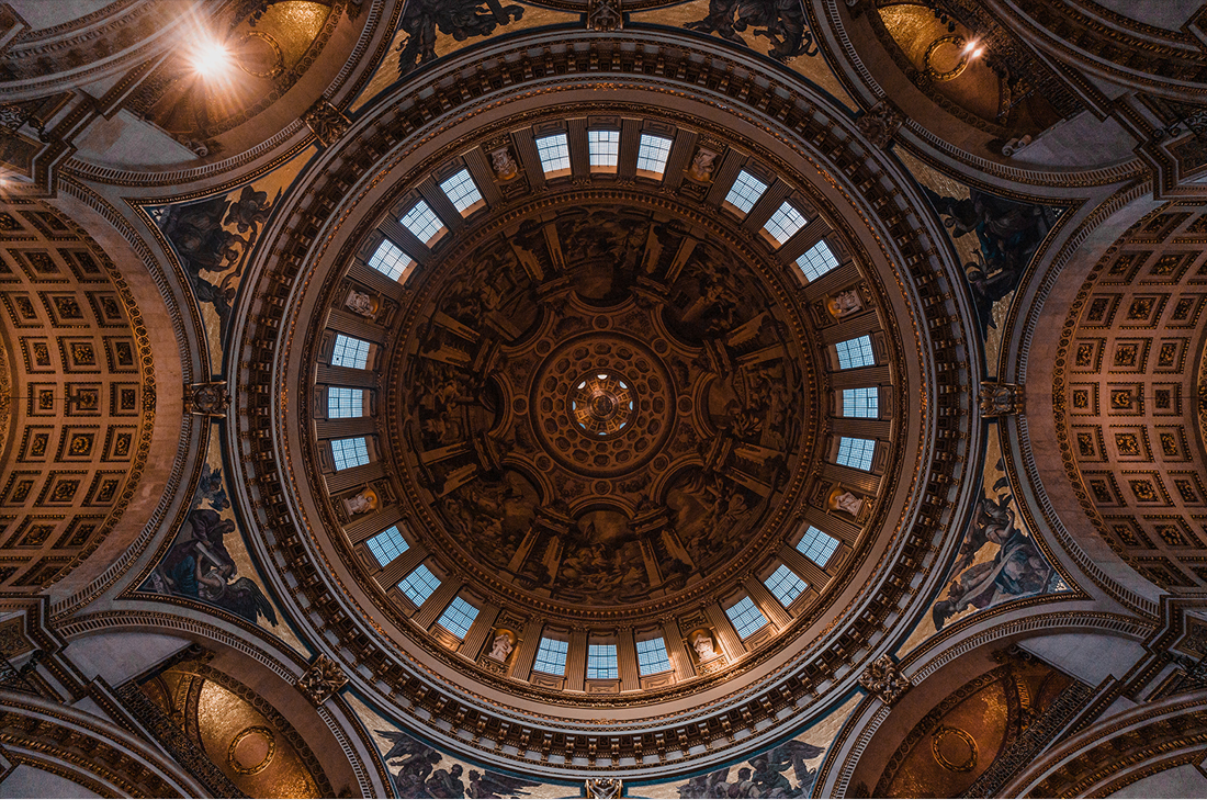
What also stood out to me when exploring the cathedral floor was the Dome, which is one of the largest domes in the world.
A wide-angle such as the Samyang AF 18mm F2.8 FE certainly made it easier to capture a large dome such as this without stitching composites together. When shooting interiors, I usually use wide-angle lenses to accentuate the features of the building. To me, a wide-angle lens creates a more immersive experience that my visual taste naturally gravitates towards.
After taking a few pictures of the dome, I went below the cathedral floor to explore the Crypt.
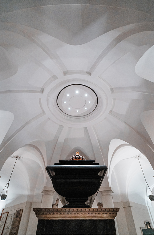
The crypt is, the resting place of the nations greatest heroes such as Sir Christopher Wren, Admiral Lord Nelson, and the Duke of Wellington. Admiral Lord Nelson lies in the centre of the crypt, directly under the centre dome. Looking at the image of Nelson's tomb above, the light right above is the light brought in through the cathedral floor.
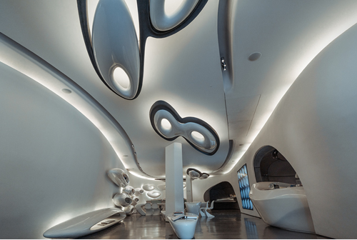
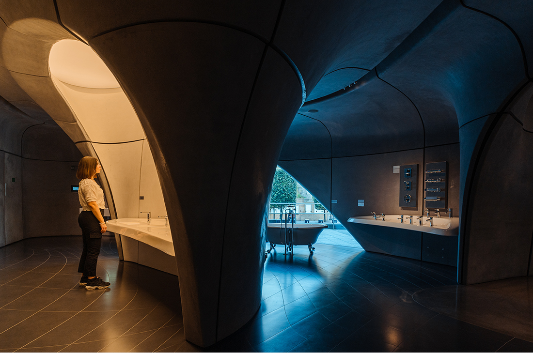
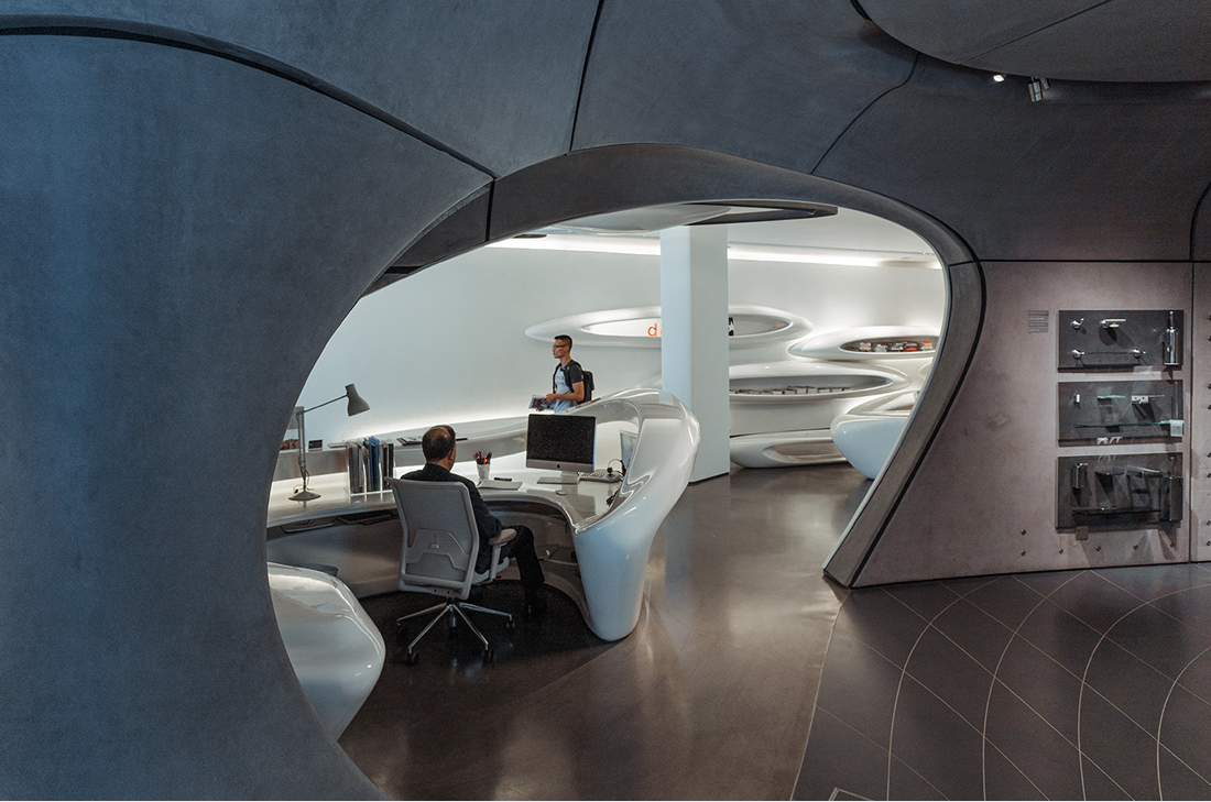
The Roca London Gallery, designed by Zaha Hadid Architects is one of the more unique interiors in London.
With water acting as the theme of the building, it has a fluid structure in its design. This goes as far as the use of the building which is multipurpose and adaptable. It’s designed with flexibility in mind with uses such as a gallery, showroom, meeting space, library, research and multimedia it truely to expresses the adaptability and openness of this building.
The flowing lines and water-inspired space certainly give the feeling of a wave, going along with the current, the curvature and the lines throughout this space. Zaha Hadid Architects certainly embodied the experience of fluidity in this building even as far as your experience navigating through it. If you love
Architecture, I recommend visiting this space to experience design and spatial qualities.
I love the clean and white interior in the main gallery and I can't help but draw similarities to the space age. Zaha Hadid Architects are certainly ahead of the time.
The showroom has a similar look to the exterior, grey concrete with the lines and fluidity. This really stood out to me due to the contrast to the white space. I immediately wanted to take a photo that really accentuates the contrast between both spaces.
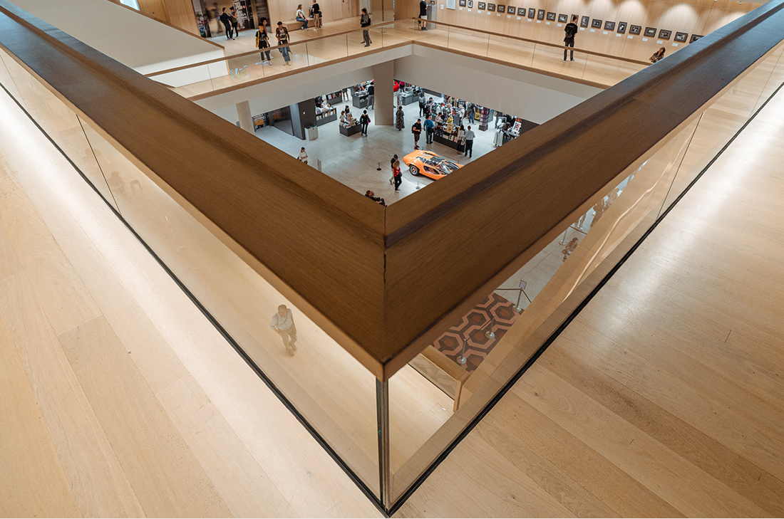
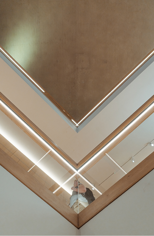
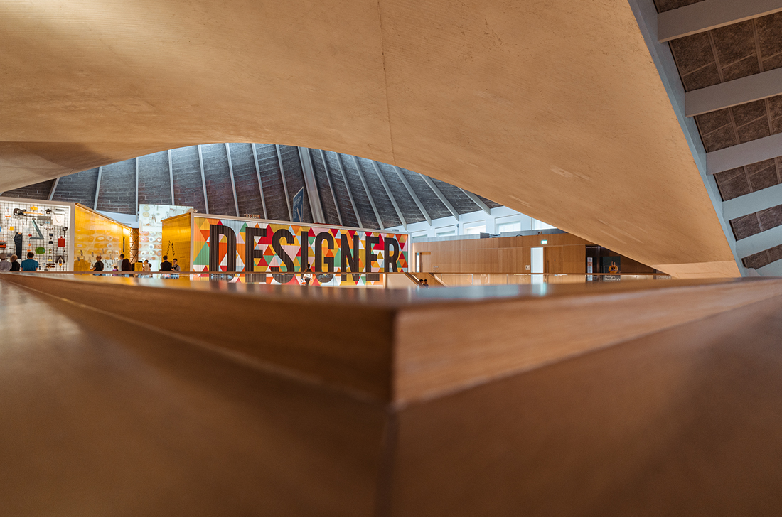
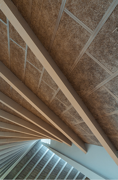
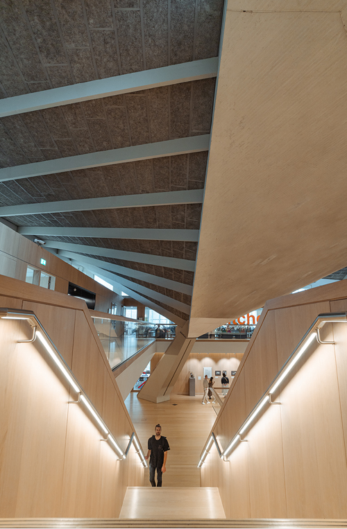
In contrast to the fluid design of Roca London Gallery, the design museum is another building I explored. With sharp edges and lines, it was great to use the perspective of the AF 18mm F2.8 FE to accentuate the features of the building. In my thought process, the lines instantly turn to triangles and geometry.
The design museum previously located in Shad Thames London, relocated to Kensington High Street, West London in 2016 with 3 times more interior space to accommodate the move.
A museum dedicated to design in various forms from architecture, fashion and graphics. I would recommend viewing this museum if you’re interested in the development of modern design in its various forms or simply to get a bit of Nostalgia on key designs that shaped the past century.
The museum goes through the timeline of design from the perspectives of a designer, maker and the end-user.
I was really drawn to the computers, video game consoles and cameras prior to my childhood, comparing them to my teenage years and this modern age. The timeline of design throughout the twentieth and the twenty-first century really shows the variety of design that people reminisce in relation to periods throughout their life, It really is a museum that brings together all ages.
Next time you visit London, I would recommend exploring with the interiors of buildings in mind.
So much so, that rather than immediately taking photos, I took my time exploring the cathedral to take in the atmosphere. Admittedly, it was difficult to look ahead as the details of the ceiling and stained glass windows certainly made me lookup.

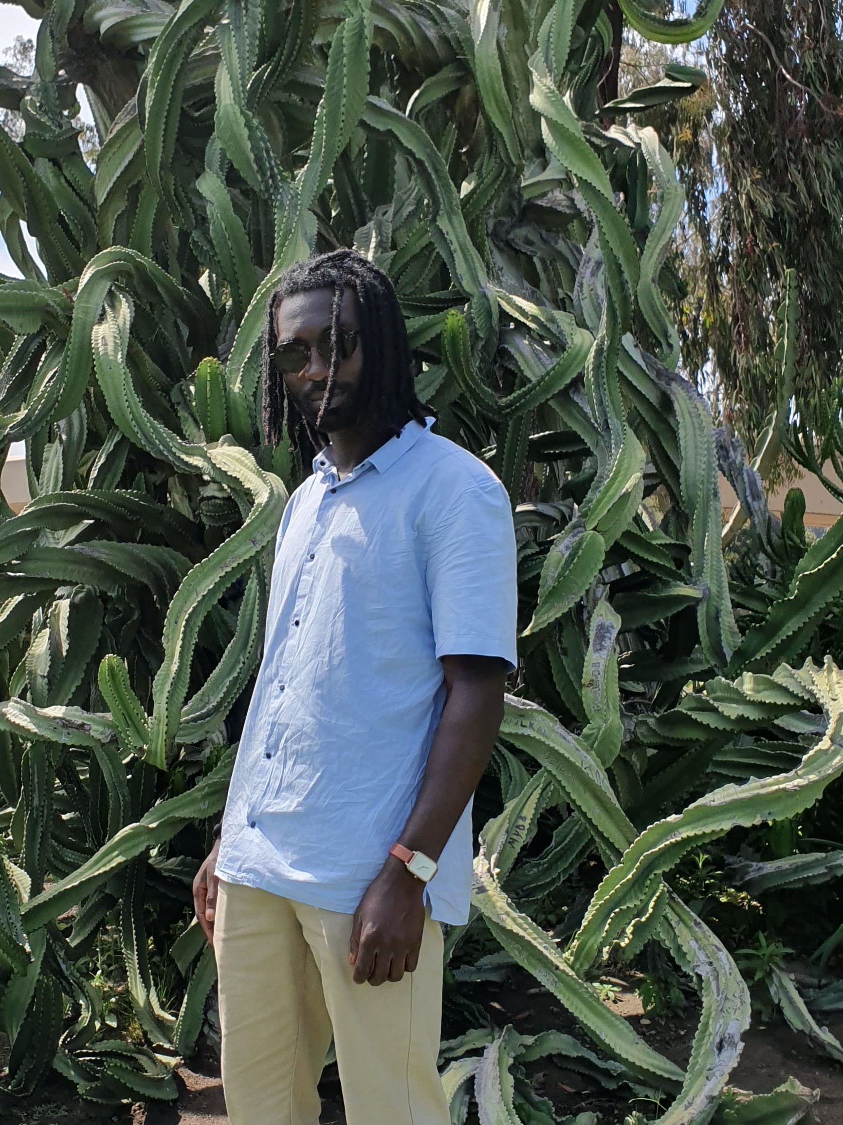
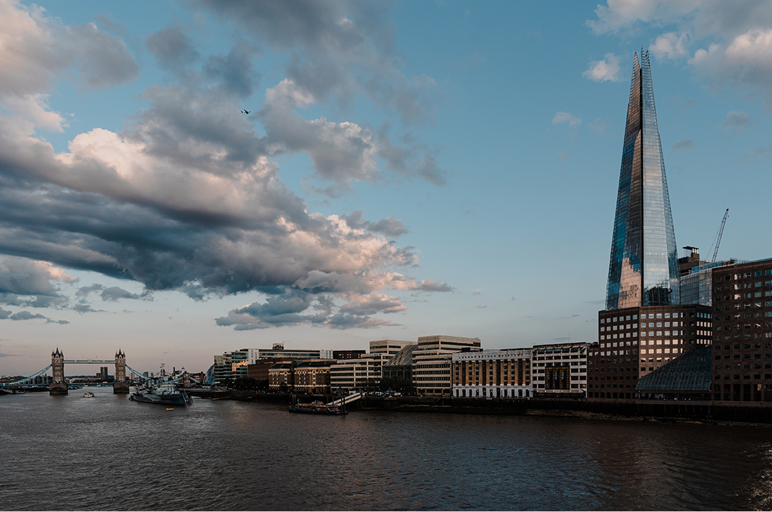
 AF 18mm F2.8 FE
 Sony
Sony
 F7.1
F7.1
 1/80 sec
 50
50
 Manual
 -
-
 -
-
 -
-
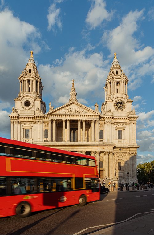
 AF 18mm F2.8 FE
 Sony
Sony
 F11
F11
 1/30 sec
 50
50
 Manual
 -
-
 -
-
 -
-



.jpg)